Soluções Pesquisas
Soluções Pesquisas is a company in which Thaís collaborated directly with the CEO and developers to design, prototype, and deliver a user-friendly experience based on UX and UI standards using a lean design process: research, design, test, and iterate.
Automating Insights: redesigning the HR Tech Experience for Data-Driven Decision Making
Soluções Pesquisas is a company in which Thaís collaborated directly with the CEO and developers to design, prototype, and deliver a user-friendly experience based on UX and UI standards using a lean design process: research, design, test, and iterate.

ROLE
TIMELINE
RESPONSABILITIES
- UX audit for mobile and web
- Research and discovery process
- Competitor analysis
- MVP
- Visual Design
- Prototype
- User tests
The challenge
The previous website did not capture the new strategic direction of the company and lacked clear information about our product. To align our digital presence with the company’s future vision, we decided that a redesign was essential, reflecting our evolution and strengthening our connection with users.
The Process
Using the Double Diamond process, I entered the Discover phase, where it was necessary to analyze the navigation flow to identify hot and cold areas on the website. Typically, I use tools like Hotjar and Google Analytics for this task, which provide detailed insights into user patterns. However, since no heatmap was installed, the analysis was conducted using Pagespeed by Google and Google Analytics. The results revealed concerning numbers, indicating significant issues that needed to be addressed.
Discovery
In this Discover phase, we sent out a survey to our clients to gather feedback on the previous website, digital experience, and users’ true opinions about it. Our goal was to ask questions related on the website’s performance and gather insights on user experiences. The majority of the feedback was constructive and highlighted the website’s lack of information.
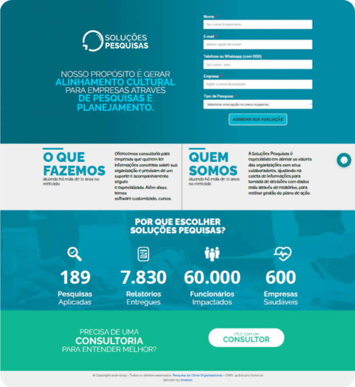
Previous site layout
The page is cluttered, lacks sufficient product information, and has unorganized content
Definition
In definition phase, we analyzed data from Google PageSpeed and Google Analytics to identify key areas for improvement in the site’s navigation flow. The results were not favorable, indicating that certain sections on the website's needed optimization.
We also gathered valuable insights from user feedback through email surveys and interactions on Facebook. The feedback was largely constructive, with users pointing out a significant lack of information on the website’s. Additionally, respondents mentioned a perceived disconnect between employee needs and management actions, suggesting a need for better alignment within the organization.
Furthermore, we conducted a competitor analysis to understand how similar companies were addressing user needs. This analysis provided insights into potential areas where we could differentiate and enhance the user experience.
Results and Prioritization
- Need to provide more information on products, partners, pricing, etc.
- Enable users to sign up for a trial without requiring a demo.
- Increase the use of testimonials and social proof.
- Ensure the site is accessible and responsive.
- Opportunity to educate users about research.
Strategic Actions:
- Affinity Mapping: Organized the issues into key themes.
- Persona Development: Created user personas to guide design decisions.
- Kanban Boards: Structured the tasks and workflow for design and development.
- Dot Voting: Prioritized the most critical product stages based on team input.
Expected Impact:
These actions are designed to enhance user experience by addressing core issues, improving content accessibility and aligning the product more closely with user needs and expectations.
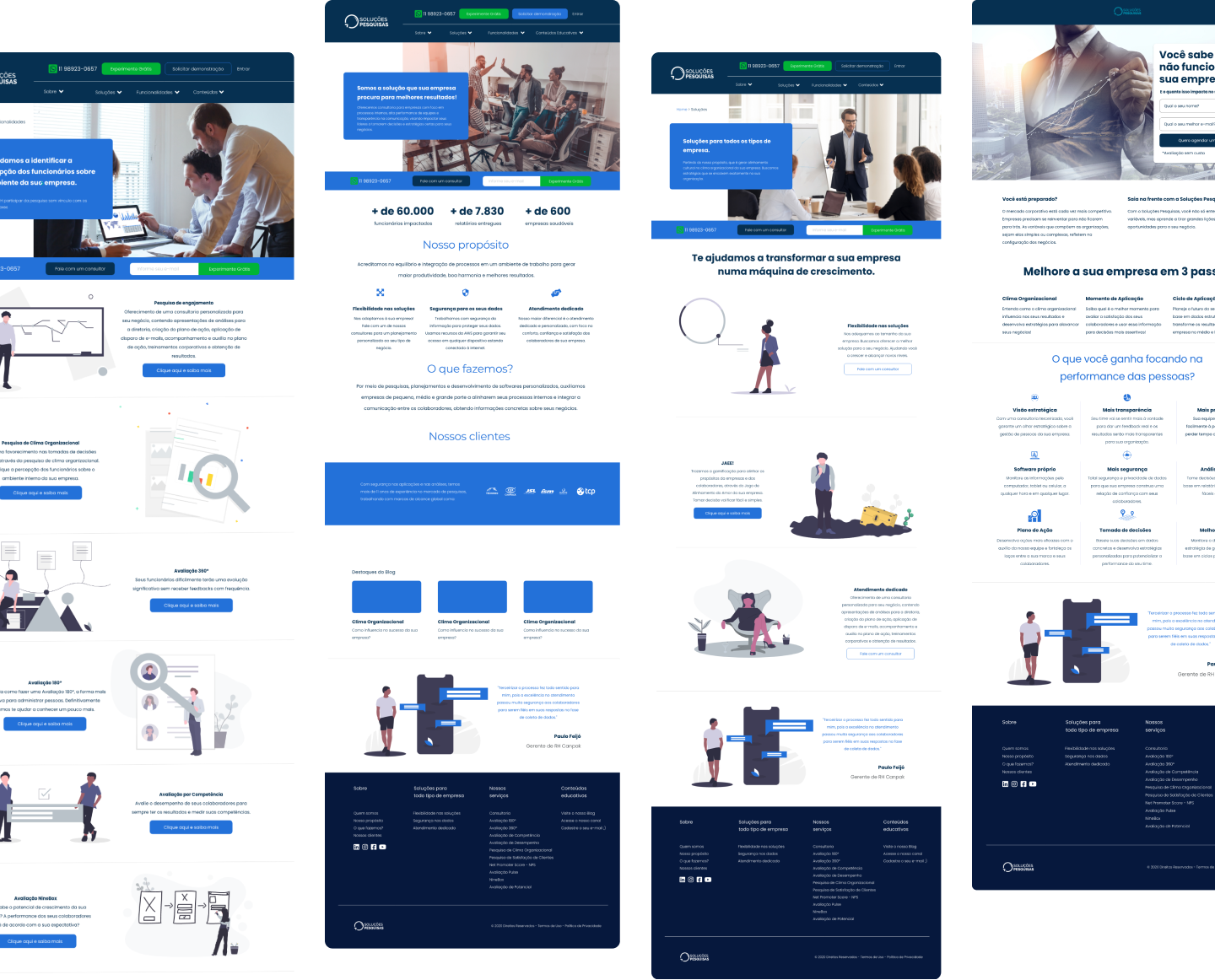
Minimum Viable Product (MVP)
To quickly deliver the Minimum Viable Product (MVP), we focused on user learning and iterative development. Based on prioritization exercises and research, we defined the core features for the website’s initial version:
1. About: This section offers a concise overview of the company, presenting our identity and mission. The goal is to ensure that visitors understand our value proposition at a glance.
2. Our Services: This area outlines each service in detail, explaining its functionality and benefits both short-term and long-term. This clarity aims to build trust and confidence with our users.
3. Educational Content: Here, we provide resources that help users understand and effectively utilize the research available, thereby enhancing their knowledge base.
To create a clear and effective structure, I used Miro to design the site map, guiding the development process.
Learnings and Considerations
I am proud of the project’s outcome and, most importantly, the learning acquired throughout the process. This case study proved to be highly challenging, as initial assumptions suggested it would be a straightforward project. However, by empathizing with users and understanding their pain points and needs, we realized there are always opportunities to add value to their journey.
As a case study, this project includes the core functionalities needed to meet the defined objectives, while still leaving room for further enhancements.
Finally, the website launch allowed us to gather feedback from clients and pivot our product, which provided valuable insights and led to a complete overhaul of our roadmap.
Check the prototype here
